Wallpapers
/
Textures
/
Top
Login
or
Register
Last Week
Most Popular Wallpaper Art
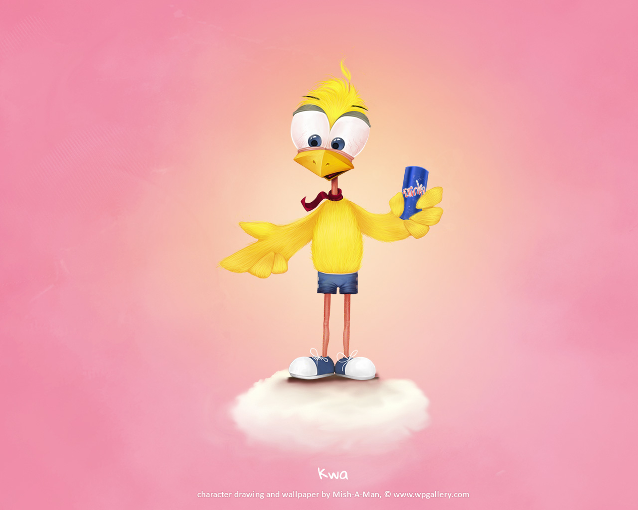
Kwa by
Mish-A-Man
26854
View Wallpaper
Havoc
by
Tri5tate
Random Wallpaper Art
21955
Music Rocks
by
Mish-A-Man
Random Wallpaper Art
8198
Infinite Spirit
by
Mish-A-Man
Featured Wallpaper
31867
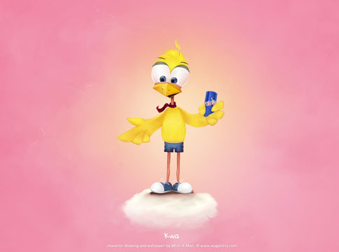
Kwa
by
Mish-A-Man
Featured Wallpaper
26854
Latest Textures
Free Download
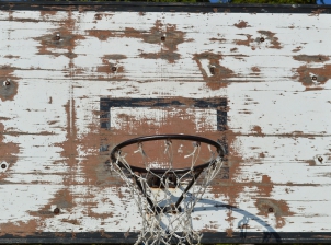
Basket Table
13163
/
0
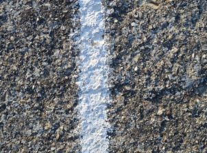
Old Road with white Stripes
12250
/
0
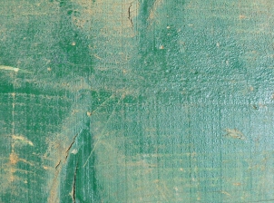
Wood Green
12697
/
0
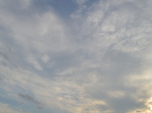
Clouds in Sunset
10677
/
0
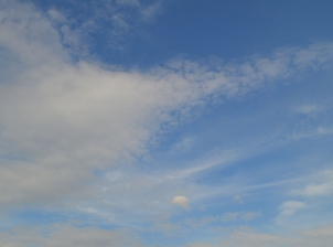
Nice Clouds
10561
/
0
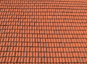
Red Roof
11323
/
0
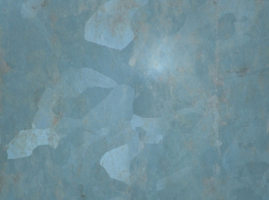
Tin Metal
10963
/
0
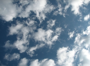
Sky and Clouds
11473
/
0